Welcome
After several years of growth in change as a company, we decided that it was time to reexamine the Spark Impact identity to better reflect our work today. We called Josh Huisenga at Chalkbox Creative, who has been a friend and collaborator since he worked on the cover art for David’s band’s first record. He and his team started sketching.
Our new logo is inspired by the gestures of a conductor’s baton, the cyclical nature of both creative and evaluative work, and the rigorous pursuit of growth and forward momentum that underpins artistic and social change.
With the new and improved logo, we needed a new website and full rebranding to match. The site needed to do all the expected things- talk about our work, help you understand how we might help you, give some examples of our process with clients- in a way that incorporates both the playfulness and seriousness of intention with which we and our partners approach our work.
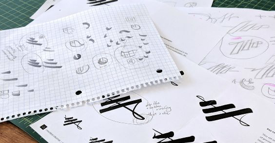
We wanted to be sure the visual elements of the site would speak to the creative partners who are our main clients. We decided to have custom icons drafted in a ‘single line drawing’ style. These drawings have a fluidity and an improvisational quality that mirrors the work of many of our partners. These sketches bring you inside the later stages of the creative process for those icons.
Do take a look around and see how they’ve been incorporated into the site. In the future, we’ll be using this blog to put the spotlight on important questions and trends in the field, and showcase some of the things we’re learning alongside our clients.